Corita Kent
B.C. Binning Gallery

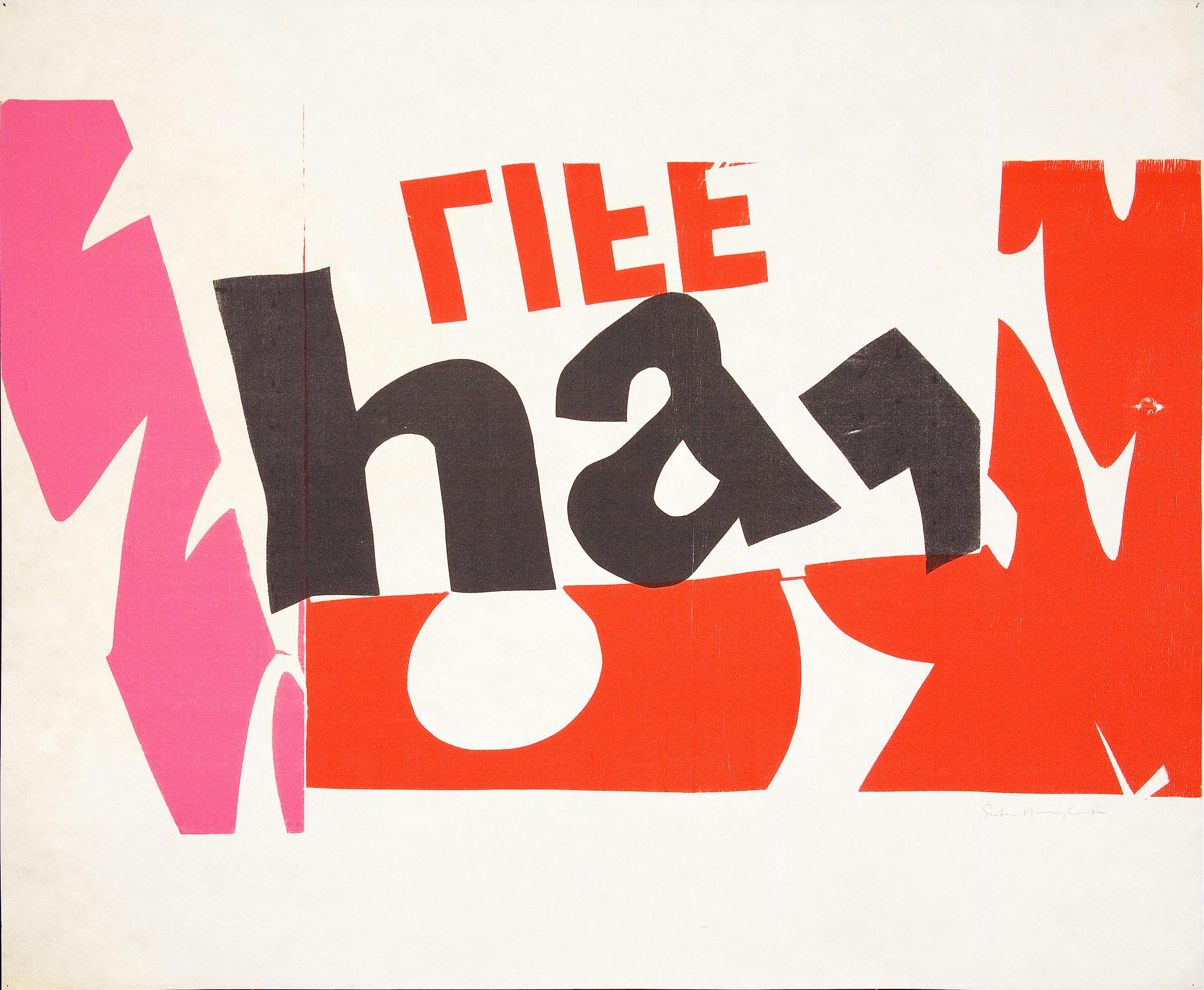
Corita Kent,* ha*, 1966. Photo: Joshua White
To create is to relate is the first solo exhibition in Canada of the work of Corita Kent (1918–1986). Corita was one of the most innovative and unusual pop artists of the 1960s, who, living as a Catholic nun in California, battled political and religious establishments while revolutionizing graphic design and encouraging the creativity of thousands of people.
Corita taught at Immaculate Heart College in Los Angeles, since the 1950s both celebrated and criticized for its progressive educational programmes. Here Corita along with other sisters initiated a lecture series that today reads as a cultural who’s who of the time, contributors including Charles and Ray Eames, Buckminster Fuller, John Cage and Saul Bass amongst many others, who quickly came to be admirers of Corita, and keen supporters of the College and its activities. In her silkscreen prints she mixed contemporary advertising with slogans, poetry and song lyrics, commandeering nuns and students to help make ambitious installations, processions and banners. For Corita her choice of printmaking was deliberate, its very form explicitly democratic enabling a wide distribution which she enhanced further by rejecting limited editions, instead making large series of individual pieces and keeping prices inexpensive. For such an output her printmaking was limited to the two or three weeks between the end of summer school and the beginning of the new school year. This annual outpouring was the culmination of all she had absorbed the previous year — images, phrases, sounds, and ideas — works born of relationships she forged between the disparate elements of society she encountered. Corita too has a direct connection to British Columbia having taught in the province during the early 1940s thereby making the exhibition even more appropriate given the time spent here during formative years. It was this period which in many ways shaped her thinking, focusing on the potential for creativity within us all linked to progressive social beliefs.
Her work and its community/participatory engagement marked a decade of utopian thinking but one rooted in the conviction that direct action can cause real change. As such she asserts the continuum between daily life and art through her work, and challenges our expectations of what and how we encounter art. This lack of division between form and activity makes for a compelling argument against the notion of detached art experience both for artists and the audience. As such it chimes with the Contemporary Art Gallery in our belief that art and its conventions should not be divorced from our everyday experience and have meaning to everyone.
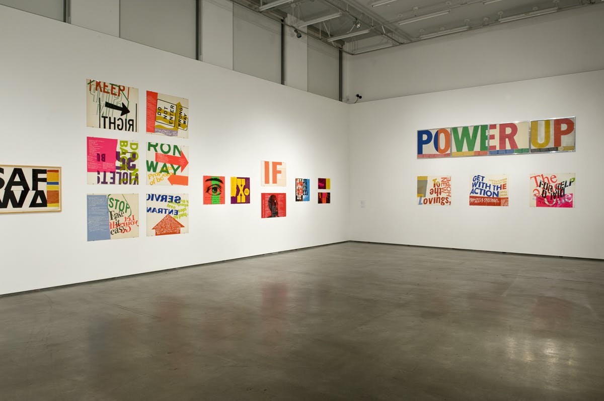
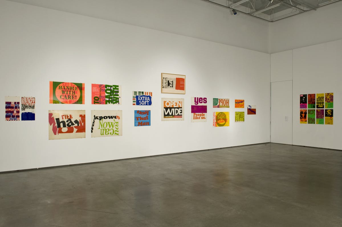
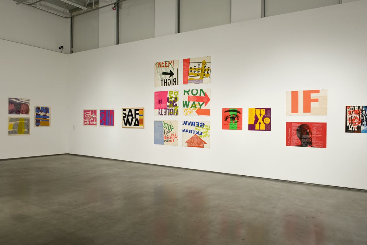
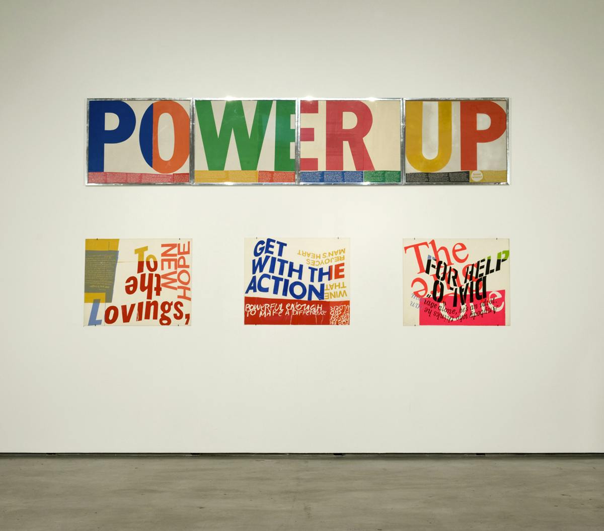
This exhibition focuses exclusively on Corita’s prints produced during the 1960s. Here we see a rapid visual move from a muted palette at the beginning of the decade to one where figurative style is replaced by an increasing use of large areas of intense abstract color. Words too find their way into her compositions often fragmented whereby they become image and the dominant compositional element. The size of the serigraphs also increases and for Corita the absorption of the burgeoning media signage, packaging, commercial systems and slogans she saw daily in Los Angeles play an important role in the development of her work. She embraced the urban environment, the commonplace becoming far from empty wasteland, rather a vehicle for hope and rejoicing. By her appropriation of the colors, design and advertising of the day, she situated her prints within a contemporary popular idiom, generating poetic work in which such visual communication is filled with social and human meaning. In someday is now (1964) for example, the partial block letters clearly derive from SAFEWAY supermarkets; enriched bread (1965) includes fragments from the red, blue and yellow of the packaging still used today by bread manufacturer Wonder, and somebody had to break the rules (1967) has the phrase jumbled but taken from a laundry detergent of the day. Her use of a viewfinder to de-contextualize source material coupled with a technique of layering and “cut and paste” collage — critical juxtaposition — create the conceptual methodology to generate new content.
Toward the end of the decade her work evolved to juxtapose song lyrics, poetry, advertising, and theological criticism. The culture of protest entered too whereby she turned her attention to racism, poverty, feminism, military escalation in Vietnam — the burning political landscape of the time. These smaller scale prints incorporate documentary material taken from magazine publications such as Life and Time. Seen in pieces such as news of the week or the cry that will be heard (both 1969) her use of posters, formal innovations and the democratic social process that resulted in their mass production reached its critical peak. Corita titled this series Heroes and Sheroes, a crucial work being phil and dan (1969) consisting of a news photograph of Philip and Daniel Berrigan burning dra records in protest of US crimes in Vietnam. These two were part of the Catonsville Nine, a group of clergy and laypeople peace activists, Father Philip Berrigan achieving notoriety as the first Catholic priest in the history of the US to serve a sentence as a political prisoner. The fluorescent colors of these prints recall the political graphics and psychedelic pop of that late 1960s period.
As with many other cultural figures Corita appeared to reach a point of activism exhaustion by the onset of the 1970s; at the end of the decade and at the height of her fame and prodigious work rate, she led the convent where she had spent her adult life. Her work shifted again returning to a more conversational and sentimental nature with simpler, cleaner form rather than the bold statement of the 1960s. In part due to her departure from the vibrancy and creativity which had surrounded her at Immaculate Heart College her move to Boston, New England also signaled a retreat from public participation to privacy.
The exhibition was developed in association with the Corita Art Center, Los Angeles and Museum of Craft and Folk Art, San Francisco. Special thanks to curator Natasha Boas.
Biography
Corita Kent became internationally recognized for her brightly coloured silkscreen prints during the 1960s and 1970s. Admired by Charles and Ray Eames, Buckminster Fuller, John Cage and Saul Bass, she was one of the most innovative and unusual pop artists of the 1960s, her work an outlet for her spiritual and political beliefs, reflecting her desire for social justice and peace during the period of the Vietnam War. As a Sister of the Immaculate Heart of Mary in Los Angeles, she ran the Art Department at Immaculate Heart College until 1968 when she left the Order and moved to Boston to pursue her practice. Over the next eighteen years Corita produced more than 400 prints and made many commissioned works such as book covers and textbook illustrations. She also remained socially engaged, designing posters and billboards for Share, The International Walk for Hunger, Physicians for Social Responsibility and Amnesty International.